Every year, Northern Plains Resource Council hosts its largest fundraising and community-building event of the year, the Annual Meeting. The board of directors developed a theme of “From Our Roots, to the Future” for the 2023 meeting. I developed event branding and deliverables based on the theme.
Scope: Two weeks
Deliverables: Logo and Event Branding, Brochure, Social Media Graphics
Software used: Illustrator, InDesign, Adobe Express
Scope: Two weeks
Deliverables: Logo and Event Branding, Brochure, Social Media Graphics
Software used: Illustrator, InDesign, Adobe Express
Team of stakeholders:
Annual Meeting Event Lead/Grassroots Fundraising Coordinator
Communications Director
Fundraising Director
Executive Director
Annual Meeting Event Lead/Grassroots Fundraising Coordinator
Communications Director
Fundraising Director
Executive Director
My role: Graphic Designer and Creative Director
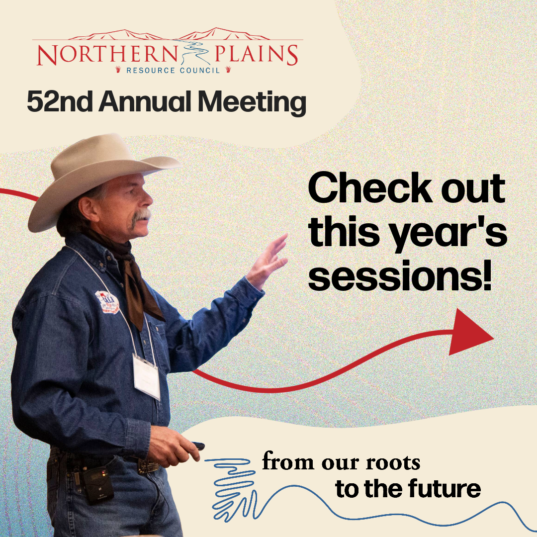
I began by leading our stakeholder team through a branding brainstorm process, using a document developed in conjunction with the Communications Director to help us hone in on what we want to communicate with the theme. The theme “From Our Roots, to the Future” was developed to highlight the organization’s new focus on the next generation of grassroots leadership, and building a sustainable future for future generations. Through the branding brainstorm, we developed a core message, a list of values we want to express, and images that come to mind when thinking of those values. From there, I got to work on developing the visual brand.
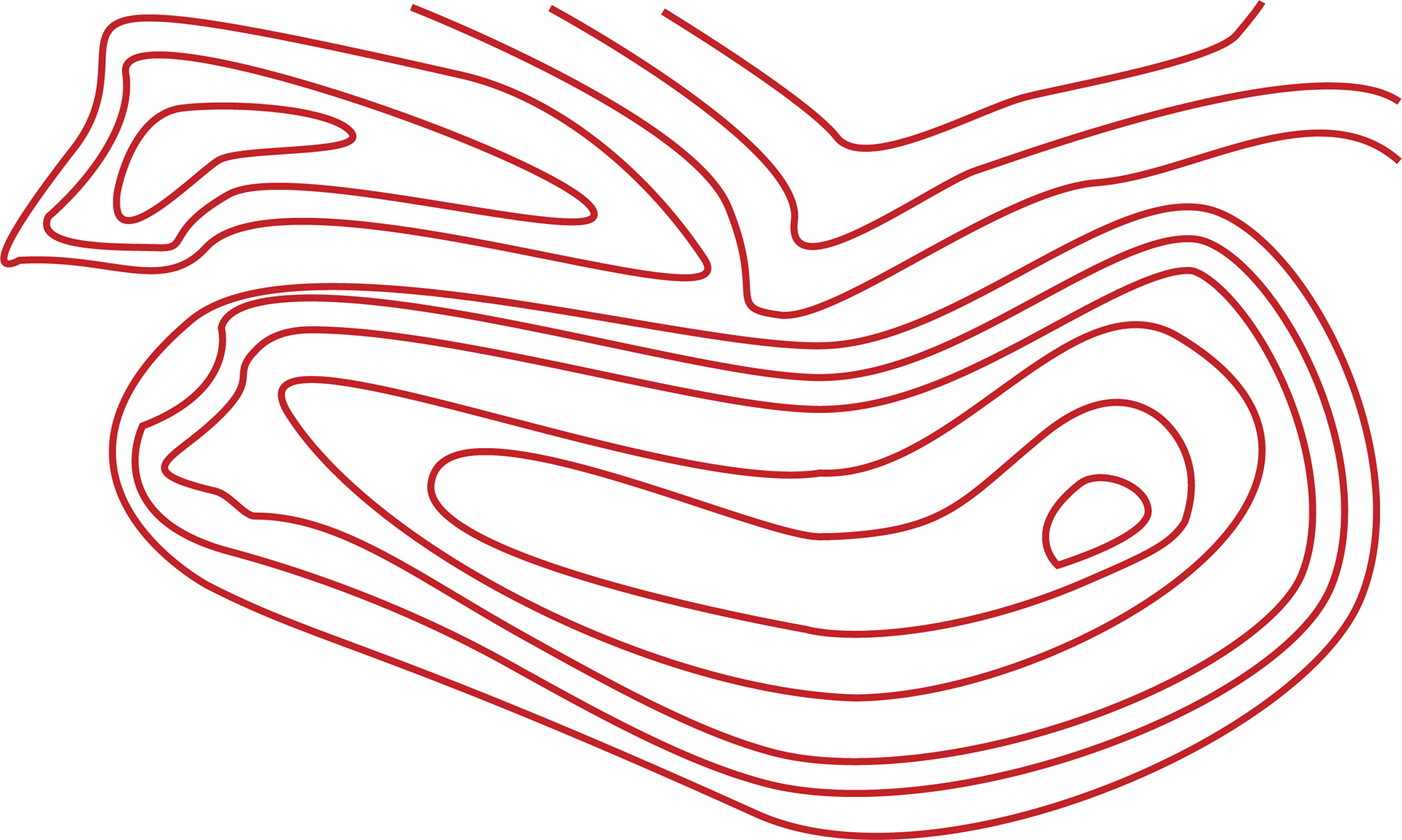
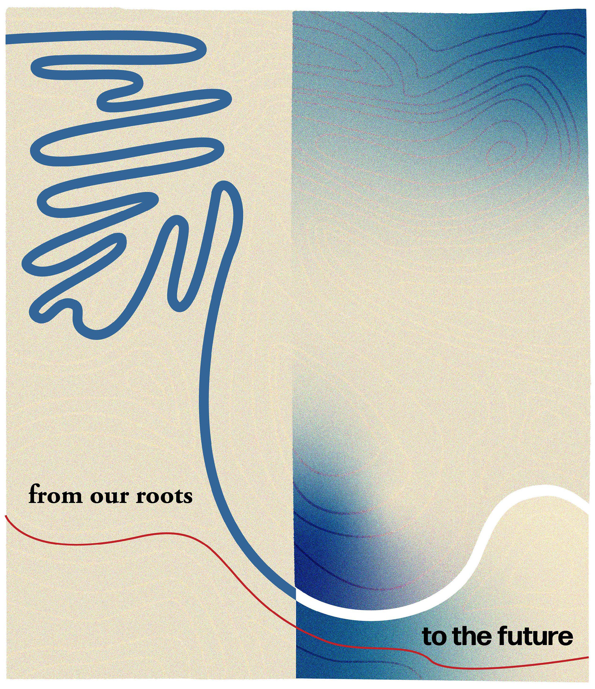
Northern Plains has endured 52 years of twists and turns as an organization, fighting big, extractive industries and protecting our natural resources. In my design process, I wanted to highlight this journey, as well as the promise of a brighter future for the next generations. My first idea was based around staircase imagery to illustrate the journey upward to a brighter future. But after more thought, I realized a river image was simpler and more on-brand to Northern Plains as an organization. Using this river idea, I created an initial branding image and a logo in Illustrator.
When I showed these to the Communications Director and Event Lead, they responded favorably to the logo right away. They liked the simplicity and did not think it needed any changes. I wish I could say the same for the branding image!
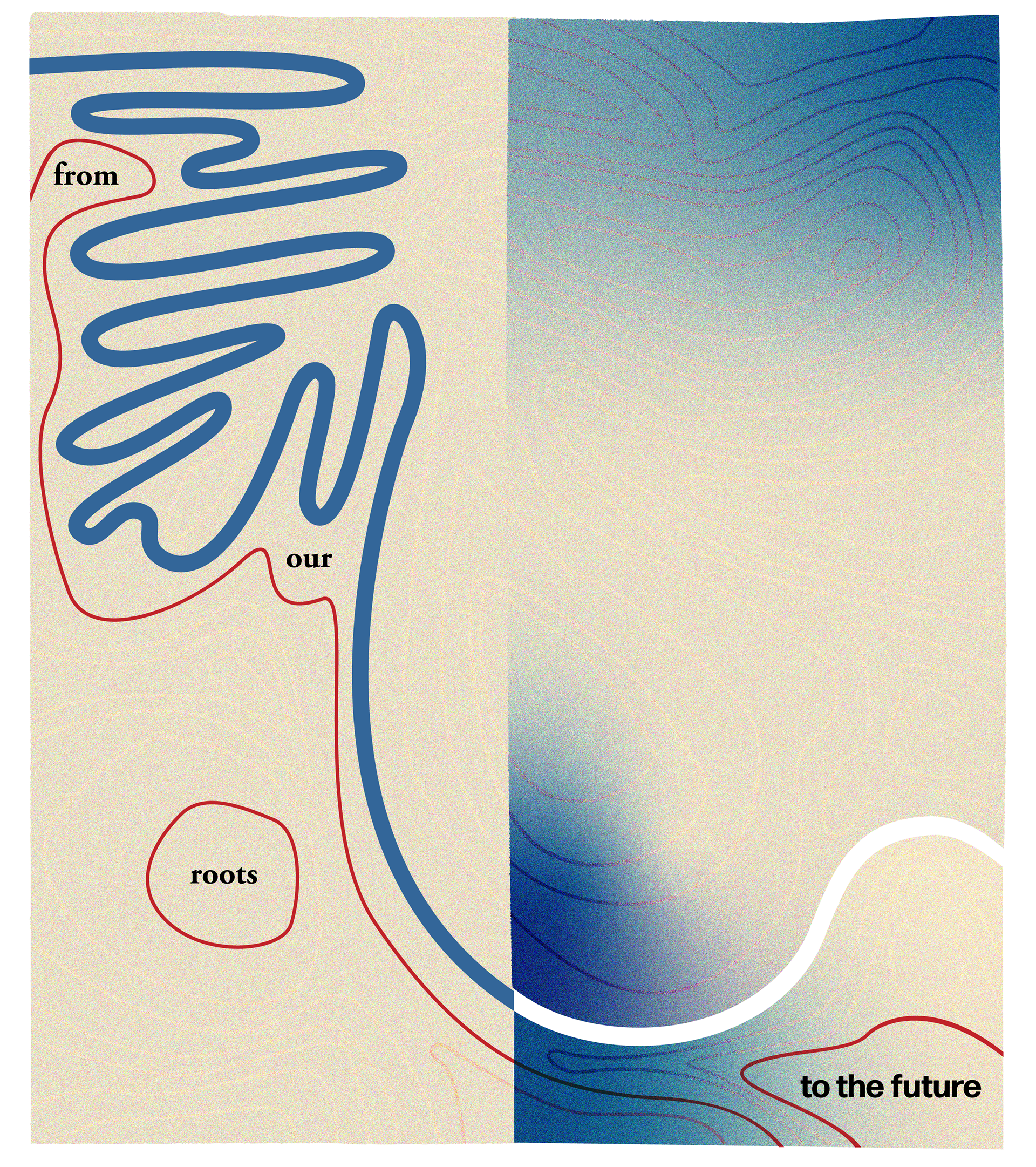
They had mixed reactions to the branding image, pointing out that the shape of the river felt off, and that the image overall didn’t quite illustrate the values and message we were going for. I took their feedback and went back into Illustrator. This time I changed the shape of the river, added more details, like background topographic shapes to echo a landscape, and changed the colors to be more on-brand to Northern Plains as a whole. I divided the image in-half to reflect the past meeting the future.
They had mixed reactions to the branding image, pointing out that the shape of the river felt off, and that the image overall didn’t quite illustrate the values and message we were going for. I took their feedback and went back into Illustrator. This time I changed the shape of the river, added more details, like background topographic shapes to echo a landscape, and changed the colors to be more on-brand to Northern Plains as a whole. I divided the image in-half to reflect the past meeting the future.
Initial Branding Image
The updated branding image was shown this time to the Communications Director and Event Lead as well as the Fundraising Director and Executive Director. The image overall was received favorably this time, with particular appreciation for the topographical elements. However, they said the text was a bit hard to read and felt off-putting. I have to admit, I was disappointed to hear this, because I liked how the red lines interacted with the text, and I wanted to lean into the theme by pushing this brand to look and feel exciting and modern. However, after changing the placement of the text, I realized it made the overall image more impactful by simplifying it. Below is the final branding image which was used on the cover of the brochure:
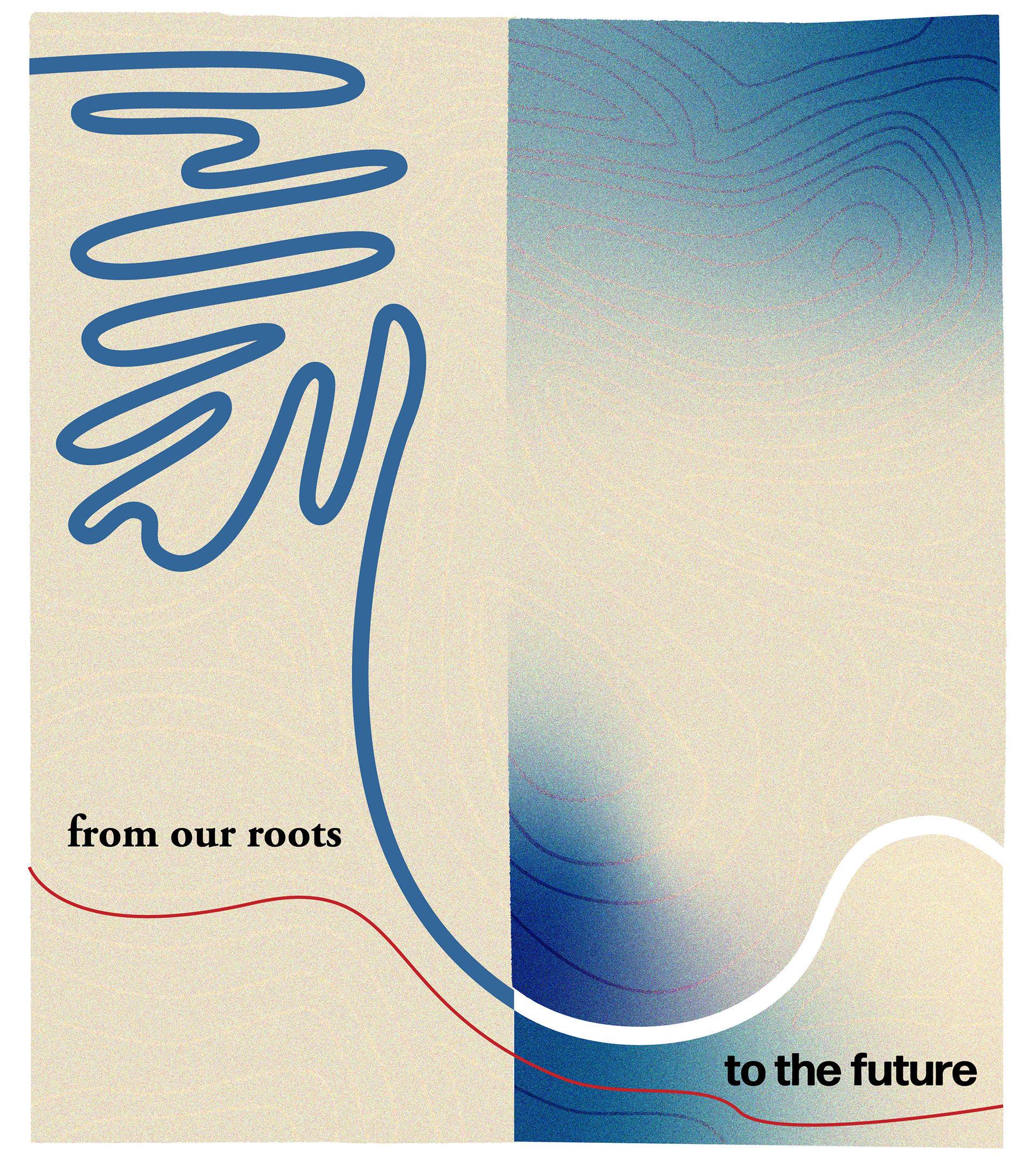
Final Branding Image
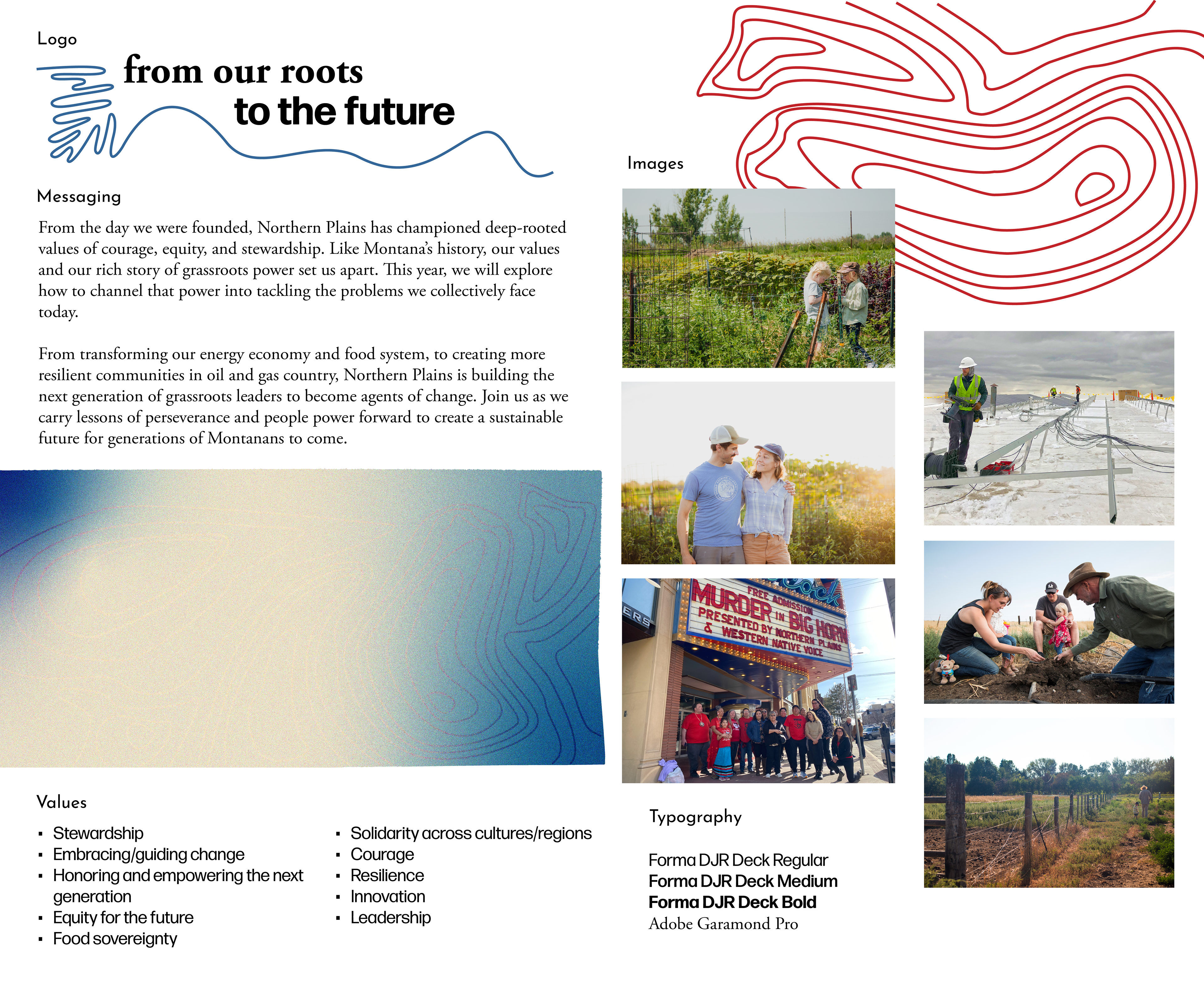
After landing the final branding image, I laid out the 8-page brochure in InDesign, and created social media graphics in Adobe Express, implementing more branding elements like lines and shapes. These deliverables all helped create cohesive communications leading up to the event.
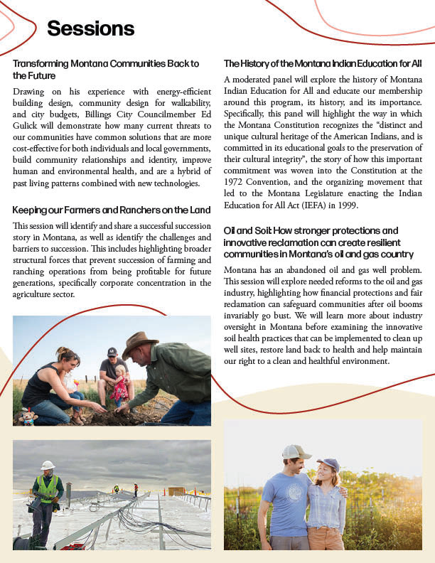
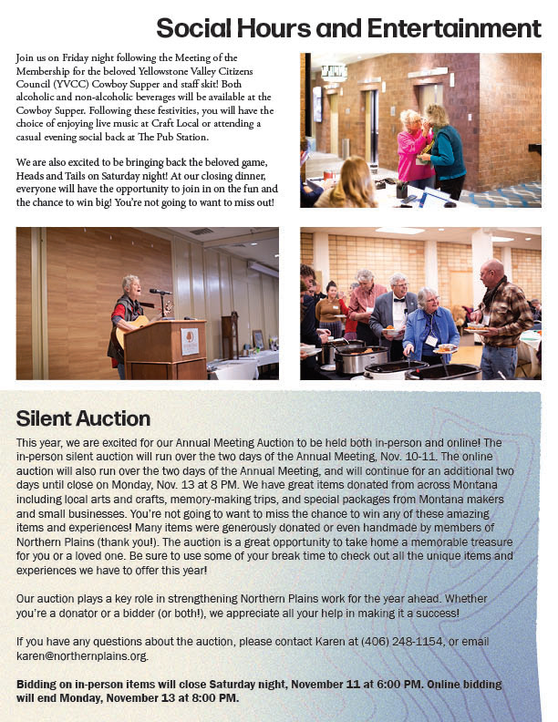
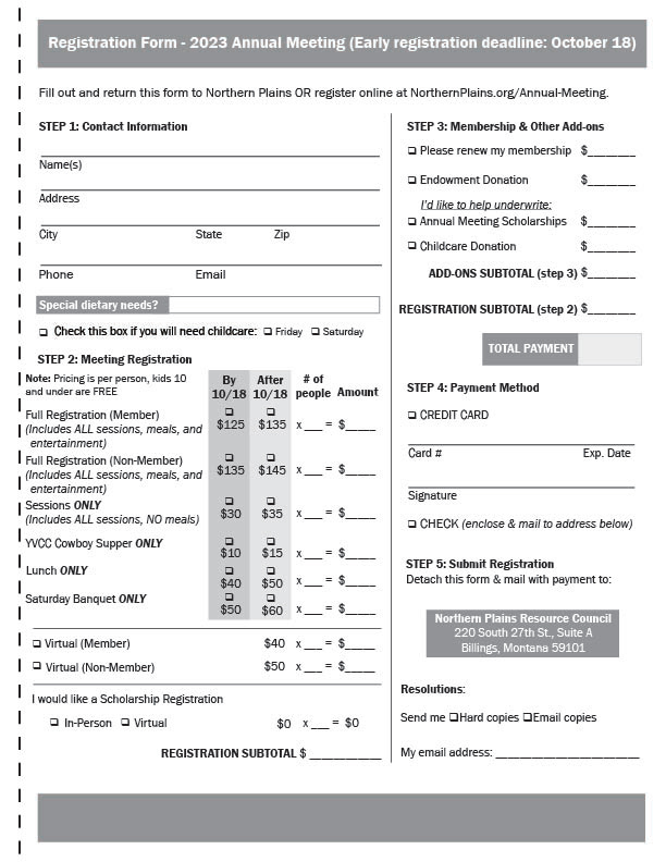
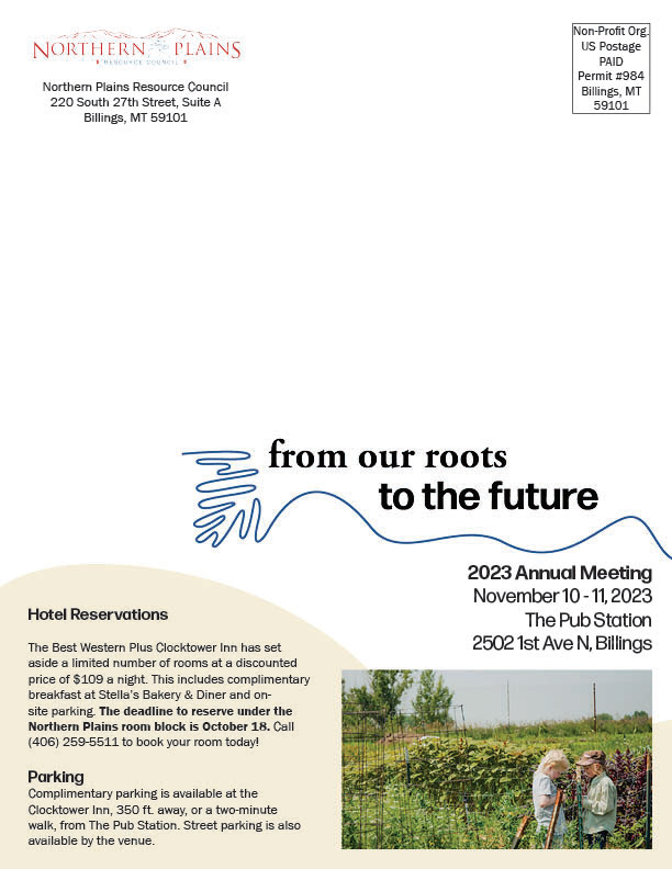
Eight-Page Brochure


Social Media Graphics
This project was a great reminder that, much like how we think of ensuring the prosperity of future generations, usually the simplest solutions are the best solutions.